
New! New! New!
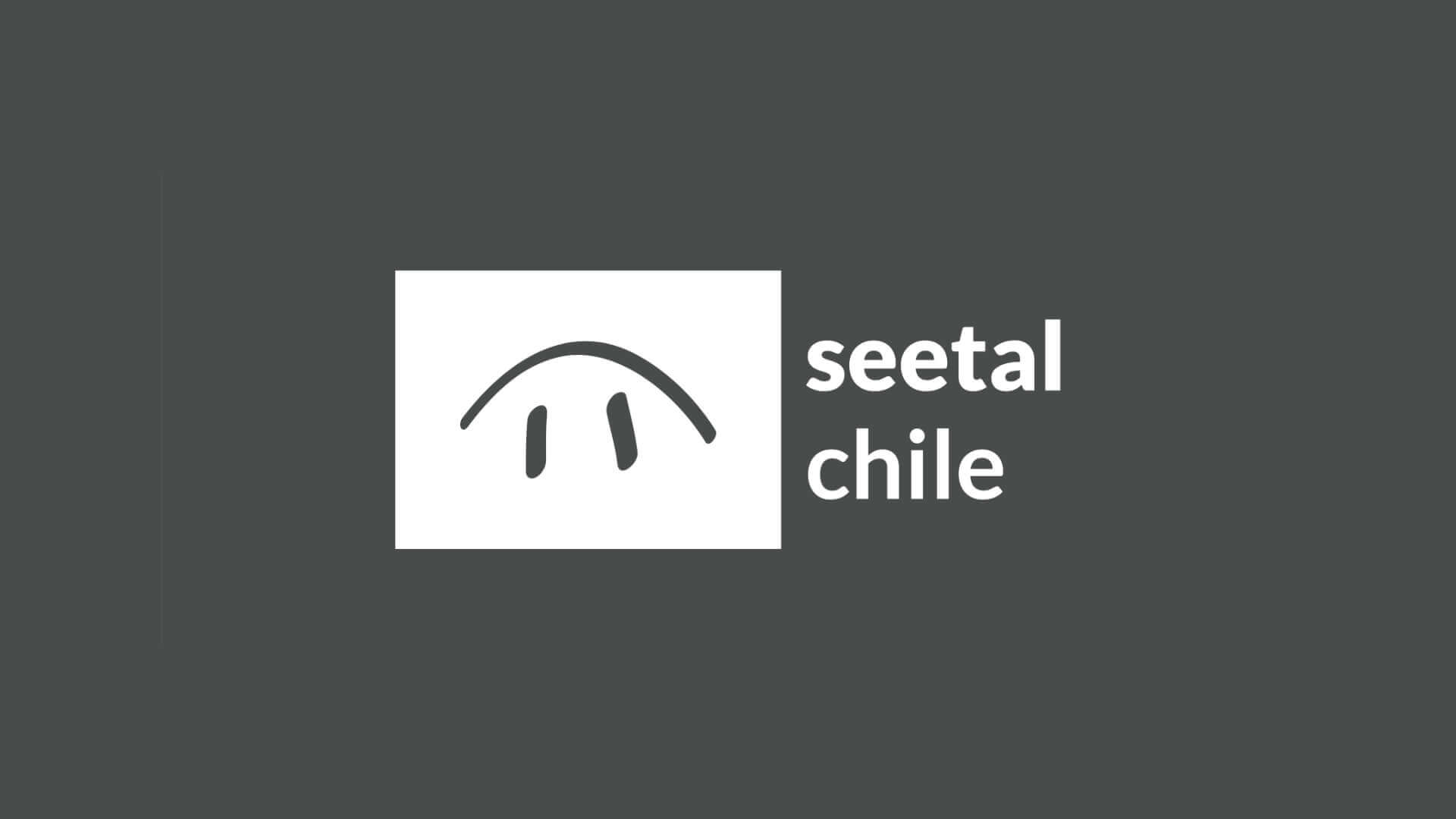
For twelve years we have been on the road with the name seetal chile and the and the corresponding corporate identity. In our daily work with the logo and typeface, it became increasingly clear that we needed to adapt to the to today's conditions.
Thanks to the additional capacity provided by our interns, we have now been able to address this issue. Yanick Altwegg worked intensively on our logos and chose a new font in an evaluation process with the staff team. We are very happy about the new corporate design, which is now being introduced step by step.
For practical reasons, the addition "Chrischona Gemeinde Seon" is missing from the new seetal chile logo. We will continue to be part of the Chrischona Switzerland Association and will make a note of this on our documents and on the door signage at the main entrance.
And by the way; the fresh seetal chile green will remain with us as an accent colour, even if it is no longer visible in the logo 🙂




Share post
About the author

Search blog
Categories
More contributions
Israel and the Church: One Origin – One Future
This year, the regional impulse evenings - together with our five neighbouring free churches - are dedicated to the motto of the year and...

Community Forum «House of the Future»
How can seetal chile continue to be a place where people encounter God, experience fellowship and faith…
























The new logo is impressive, consistent and also meaningful. Congratulations
Ruedi Kunz